Over the Christmas period, I decided to gather more primary images (with the help of my friends) to create the artwork I wanted. I started off with sketches and ideas of what I could draw, trying out compositions, and the colour palettes I could use.
My first idea was to experiment with different colours of paper to draw on, but I needed to make sure that I can get the skin tones right, so I did little test strips and used my soft pastels to blend and create the colours/shades. The rest of the sketches were somewhat random as I didn't have solid ideas yet.
I created these sketches with mixed media such as: pencil, highlighters, pastels, fine liners, coloured pencils etc. I wanted to focus on faces and poses that I referenced from my visual (Collage) of imagery.
My sole focus is faces and natural beauty combined with high-fashion and editorial looks. I went for those ideas as it related to the fashion industry - this project may be viewed by my chosen universities.
I decided to have some fun with composition and colour. I liked the idea of overlapped faces however I need to figure out how it work out if I coloured them in. The next to pieces, I used red and blue paper to see what kind of effects I can get that didn't require drawing actual skin tones, just using what is given.
I really liked the red paper drawing of Charlotte as I used vibrant contrasting colours to make the drawing a pure focal point to the audience. As for the blue piece, I like it too however I could've added more detail and see what colours could've made it feel more complete.
The last one is a close up of Megan's face as I wanted to recreate the idea of Peter Devito's photography where the models show their bare skin with an inspirational message. I really enjoyed doing this one as I could focus on every detail of her skin and I think it turned out well. I only really struggled drawing her eyes as naturally it looks blue but she has various of shades in her eyes such as blue, green, grey and brown. For the details I mostly used colouring pencils.
* A close up of the sketches.
For Charlottes drawing, I found it really difficult to create her light toned skin shade, So I decided to use the red for what it is, and I think it turned out better than if I had a white cast on the paper!
*Close up of sketches.
Final outcome:
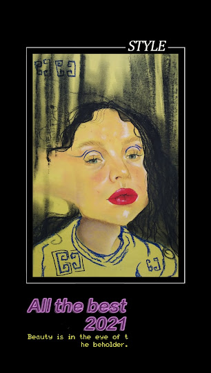
For this final outcome, I was inspired by the illustration work of Antonio Lopez as he focused on a huge contrast of colours in his art that was so captivating to me. This drawing was interesting as it had a few setbacks. Firstly, I found it difficult to draw a good skin tone on yellow paper but after blending a lot I think it's acceptable enough. I used a royal blue soft pastel against the yellow paper to be the main contrast (other than the lips and black hair), as the colours compliment each other well. I added detail that was inspired by my bedsheets (pattern) and gave her blue eyeliner for a more editorial look.
As for the big setback, It was the hair. I wanted to created her hair strands using a thick, black sharpie pen, however I didn't think it through enough as I drew a basic straight line going from the root to the shoulders. It looked terrible. In panic, I decided to give her wavy hair to add volume and fill out the page using a blacks soft pastel over the pen. It still looked odd. But I quickly realised I should keep the same pattern going in terms of the style of the drawing. Her face was faded, so I faded the black hair upwards which fixed my problem as it gave a nice direction and a flow to the piece!
Next time I may need to experiment more on my placement of things.
*Same drawing with tracing paper over it for protection.
Overall, I am still trying to figure out my exact path in this project but I feel doing something is always better than nothing. I have to be honest, experimenting was extremely difficult for me due to Covid-19 restrictions and delays. I really wanted to produce more than just drawings and sketches. When I go back to college, I can explore more of my ideas such as incorporating textiles within my work as it will add another good element and texture to my drawings. I am planning to do some sampling and adding it onto future work.
Edited photos by the app MEITU:
Meitu is one of China's top Internet enterprises due to it's amazing AI image and video processing technologies and social community. It was founded in October 2008 and their mission is "To let everyone become beautiful easily". As of June 2020, here are 2.08 billion downloads of the app with 295 million monthly active users of Meitu apps. I use the Meitu - Status Maker, Pic Filter & Beauty Cam app specifically as It provides high-quality editing and a range of filter, frames and collage options for free. The app helps me to fix images and add some flare to them, here are some examples:
The app is great to create any atmosphere or aesthetic for your work and It has helped me edit my drawings into fashion-like frames in a matter of minutes straight from my phone.
Meitu.com. 2021. About Meitu-Meitu Inc.. [online] Available at: <https://www.meitu.com/en/introduction#history> [Accessed 4 January 2021].
Meitu.com. 2021. About Meitu-Meitu Inc.. [online] Available at: <https://www.meitu.com/en/introduction#introduction> [Accessed 4 January 2021].
Primary Images/Reference:


Comments
Post a Comment